Introduction
“The eyes feast before the stomach” and “eating with your eyes” express the phenomenon of seeing the visual appeal of a food as an indicator for taste. As such, scenes within film depicting and emphasizing a dish or a meal can cause the audience to salivate and long to experience the dish being presented without any of the other sensory input included. Japanese cuisine depicted within film usually gets this reaction. However, the depictions of food within anime has built a mass fanbase that has skyrocketed intrigue towards and popularity of Japanese cuisine amongst Gen Z, Millennials, or anyone who has been graced with watching a Ghibli movie. Studio Ghibli’s distinct stylization of food has left many scrambling to recreate and learn about the cuisine presented, from the domestic Howl’s Moving Castle’s cast iron eggs and bacon to the extravagant tables of various dishes in Spirited Away.
The mass fanbase and love for the aesthetic leaves a few questions: what is it about anime food that can elevate it above other live action depictions of Japanese food within film? Is it the influence of a specific ‘Japanese’ visual code that afford the dishes to appeal to the masses? I have explored this idea through recreating screenshots of Japanese dishes from movies centering around food in a style that emulates food in anime film. Through this comparison, I hope to expose the nuances in how these dishes are visually constructed, represented, and received by an audience. Deconstructing these images can bring into relief the elements that the anime style can emphasize and create a hyperreal imagination surrounding the food.
To talk about the food within 2D anime (this meaningfully implies the existence of 3D CGI anime, which will not be discussed), grounds for “anime” and “anime food” must be defined. Animation will be seen as a medium rather than a genre of film within the context of this examination. Thus, an examination of food within Japanese anime will be seen as how dishes are featured and examined in Japanese-style animation. Additionally, the examination will not cover the thematic use of these dishes, but rather strip the dish down to how it is represented visually outside of the plot and metaphor it represents within the films. In short, anime style food will be examined purely for the intent to discern the aesthetic composition and elements going into showcasing the dish. Note that in the film, these dishes are also in movement and interact with the actors and characters in a way that cannot be captured within a still of the dish. However, other facets can communicate the same meanings within the still. These will be discussed later.
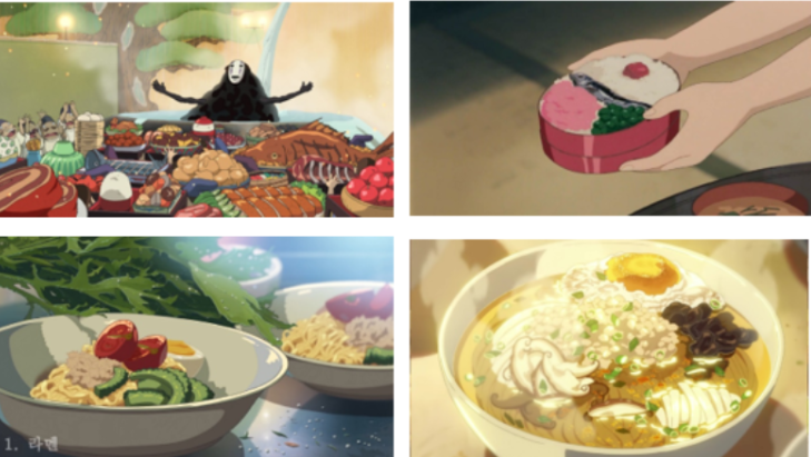
Figure 1: Some of the reference images for the “Anime Food Style.” From top to bottom and left to right, Spirited Away (dir. Hayao Miyazaki 2001), My Neighbor Totoro (dir. Hayao Miyazaki 1998), Garden of Words (dir. Makoto Shinkai 2013), and Flavors of Youth (dir. Li Haoling 2018).
Inspiration for the artistic style originated from works from Hayao Miyazaki (ex. Howl’s Moving Castle (2004), Ponyo (2008), Spirited Away (2001), My Neighbor Totoro (1998)) and Makoto Shinkai (ex. Garden of Words (2013), Your Name (2016), Weathering with You (2019)) films. The selection was based off notoriety. Numerous Twitter threads, blog posts, and entertainment articles reference the Ghibli aesthetic with threads and long posts filled with gifs of jewellike, artfully rendered pictorial tomatoes being chopped, eggs being whipped and fried, pots being served, etc. However, most of these gifs come from Shinkai’s Weathering With You (2019) with a minority from Li Haoling’s Flavors of Youth (2018), thus the imagination of “Ghibli”/”Anime Movie Food” seems to follow a somewhat hybrid of Miyazaki and Shinkai’s style. While Li’s works also use the anime style to depict food, there was less emphasis on Studio Haoliner’s style. However, I still considered and referenced elements of Haoliner’s style because it is conflated with “Ghibli style food.”
The media and contents of each painting were considered based on both director’s selected media and the constitution of a Japanese meal. The mediums the directors use vary, especially because of the time they were created. The 2010’s brought the digitalization of anime production while in the 1990s and early 2000s, there was only cell animation using special paints and traditionally drawn backgrounds. To get close to both, I used traditional techniques to paint each dish. Specifically, each painting was done using acrylic paint on copy paper (I could not source the appropriate paper). Considering time constraints, a summary of a hypothetical typical Japanese breakfast, lunch, and dinner were selected with one dish per meal. Each painting was shown to a group of individuals to gauge a general reaction to the dish. The dishes selected come from three different films: omurice from Ramen Shop (a.k.a. Ramen Teh) (dir. Eric Khoo 2019) for breakfast, ramen from Tampopo (dir. Juzo Itami 1985) for lunch, and Japanese style hot pot from season 1 episode 7 of Midnight Diner: Tokyo Stories (dir. Joji Matsuoka 2016) for dinner. Screenshots were taken from each film and replicated using the formulated Miyazaki-Shinkai Ghibli hybrid anime art style.
Dissections of both the reception from peers and introspections into the creation of each painting give insight into the mechanizations that compose the feeling of each scene. The aesthetics of each plate are important to imbuing any plate with the feelings that the chef wants to invoke within the recipient (guest, customer, family, friend, etc), but the ways in which Japanese films play with those visuals is distinct in how the plate is arranged and the settings of which they are placed in. Through the manipulations of film and what is on screen (lighting, coloring, etc), Japanese cinema (via anime or live action film), can further attempt to invoke this visual appeal to their dishes. The distinction between the two forms comes with 2D anime style’s ability to afford the viewer to not only see the dish, but to create an imagination and fantasy of experiencing the dish that cannot be said for a live action depiction of the same dish, which exists too much within reality.
Crash Course on Japanese Cuisine and Aesthetic Plates
Within Japanese cuisine, there are more formal “traditional” style dishes and other Western derived dishes. Washoku (和食) is the general term for Japanese style cuisine that has been used to differentiate Japanese cuisine from Western cuisine. Kaiseki (懐石) generally forms the foundation of traditional style Japanese cuisine. While both were modern conception that arose within the nineteenth and twentieth centuries, they have proliferated the national and international consciousness of what is considered “Japanese cuisine.” There has been confusion about the lines of which washoku begins and kaiseki ends. However, Cwiertka and Miho argue that this framing of kaiseki as washoku and vice versa was intentional with how the Japanese government conflated the meanings of both within the documents submitted to UNESCO and the portrayal of both within Japanese media. Rath defines kaiseki, separate from washoku but related as a subgenre of Japanese cuisine, as a modern form of Japanese haute cuisine served during lunch or dinner that feature “carefully prepared morsels of food are accented by beautiful tableware offering a high standard to judge the aesthetics of any meal.” Aesthetic appeal and the elements that contribute to that presentation are central to this style of cuisine in a way that makes it distinct from other culinary forms due to the centrality of aesthetic to the style. Yōshoku (洋食) is a subgenre of Japanese food that derived from Western imported recipes and food, specifically those from Anglo-Saxon origin that were more common amoung the worker class. This style is better understood as Western food that has changed to become uniquely Japanese over time and adjustments to fit Japanese sensibilities. In modern Japan, a bulk of meals, rather than following the lines of “traditional” Japanese foods, are filled with Japanese-style Western foods.
The aesthetic language for Japanese cuisine encapsulates certain sensibilities that have traditional origin, however those supposed tenants do not necessarily hold true between categories of Japanese cuisine, such as between the elitist kaiseki and the more common yoshoku. For simplicity’s sake, kaiseki aesthetics will be the conduit for which Japanese culinary aesthetics are understood as most cookery involves or attempts to incorporate some tenants of kaiseki practice since it is the basis for the imagination of “Japanese cuisine”. In an oversimplification and generalization, kaiseki consists of a rice, soup, and side dish with soy used as the primary flavoring. However Japanese cuisine has expanded to include ingredients and techniques that are not necessarily traditional, such as frying foods like in tonkatsu or the inclusion of beef, eggs, or onions and sauces that are not soy based. Core tenants define the means and the ends to the means that create a traditional Japanese meal. Rath explains how the crux of kaiseki cuisine is the idea that “Japanese food is ‘eaten by the eyes,” which is substantiated by Cwiertka and Miho’s listings of kaiseki’s fundamental principles: “1) Use the best-quality ingredients, giving preference to ingredients in season (known as shun) or slightly ahead of season (known as hashiri); (2) Avoid the repetition of cooking techniques in the same meal; (3) Serve each dish at exactly the right temperature; (4) Devote equal attention to the taste and appearance of each dish, neither of the two should be compromised; (5) Make sure that the food is always served in harmony with its surroundings—the tableware, the space, and the season in which it is being consumed.” Japanese cuisine thus places a large emphasis on the creation of an visually pleasing plate down to how and what is being placed on the plate, which plate, at what time, and in what setting. This results in a type of cuisine that centers around the aesthetic. How those components are arranged, and how rigid the rules for arranging items varies between dishes for more formal settings (kaiseki or washoku) and casual settings (yoshoku). However, it must be noted that yoshoku does not necessarily follow these tenants to a tee, however, through looking at the plates themselves, there is an intentionality that speaks somewhat echoes how ingredients would logically be placed in reference to making those elements more pleasing. This will be explained further.
The overall goal is not only to make a visually interesting, delicious dish to elevate each ingredient, but to also construct a landscape that the recipient of the meal navigates and understands the ingredient and dish’s nature through. These constructions will play with the seasonality, texture, color, and setting, which has the intent of emulating and creating a connection with nature. For example, the kinds of plates and dishes served can depend on which season the meal is prepared (cold dishes and plates in the summer and warmer ones in the winter). The emphasis on seasonality can be attributed to, in Saito’s interpretation, Shintoism and Buddhism’s ties with nature and spiritualizing the land. Further manipulations of each ingredient are considered based on how to showcase each ingredient best and how to create a visual where they all mingle. The intent is to “render fish more fishlike, and rice more ricelike.” This is conducted in every sense of the phrase: to season and cook the dish in a way that will bring out its best flavors and colors on the plate (with even the inclusion of inedible parts to emulate certain shapes and textures), and to arrange those dishes in an artistic way that allows for those qualities to shine. Each step and technique is utilized to enhance the properties of each ingredient and each dish presented, such that each part of the whole is able to be best highlighted and contributes to the overall appeal of the table. In this sense, the fish becomes more fishlike, and the rice can become more rice like. It is a hyper performance of what the ingredients appear.
Intensive and attentive manipulations for the sake of visual presentation call attention to the connections between aesthetic and culinary customs within Japan. Whether or not the claims to being truly “traditional” are legitimate, the pervasiveness of these practices is the current interpretation and general practice conducted within the Japanese culinary space. As a result, washoku has generated a visual lexicon for a generalized Japanese cuisine. The utility, then, to imbue food with this aesthetic quality should bleed into film. Extrapolating from the emphasis on aesthetic, this care should also be placed into how food within film is represented: it must be done in such a way that conveys the same intentionality and purpose as the manipulations of tangible food.
Exploring the 2D Anime Space: Anime vs. Live Action
2D animation creates a space that affords the viewer a distinct fantasy and imagination that cannot be extended to a live action representation of the same event or object. These principles extend to representations of food within anime films, where intentional uses of color, shapes, and composition combine with the abilities a stylized pictorial representation to create a hyper realistic image that further plays with the imagination and generation of a fictitious reality and expectation for the dish. By playing off those ideas, the image can then create a fantasy that lives within the mind of the viewer that can allow them to “taste” without tasting. Given that Japanese cuisine already facilitates the basis for creating these landscapes of imagination, emphasizing those visual aspects, and exaggerating them visually through the stylization of the dish only acts to heighten that experience. This cannot be done through a simple one-to-one, photorealistic representation of those aspects since the effect can only be achieved through exaggerating reality.
The Creation of a Dish: Colors, Lines, and Plates
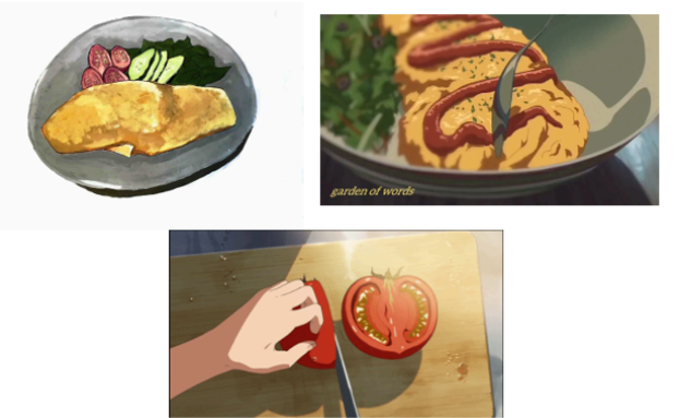
Figure 3: On the top left is my painting based off the omurice from Ramen Shop (dir. Kevin Woo 2019) and to the right and bottom are the reference images used to create the image (top right is from Garden of Words (dir. Makoto Shinkai 2013) and bottom is from Your Name (dir. Makoto Shinkai 2016)). Additional references used are those in Figure 1.
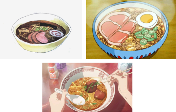 Figure 4: On the top left is my painting based off the ramen from Tampopo (dir. Juzo Itami 1985) and to the right and bottom are the reference images used to create the image (top right is from Ponyo (dir. Hayao Miyazaki 2008) and bottom is from Your Name (dir. Makoto Shinkai 2016)). Additional references used are those in Figure 1.
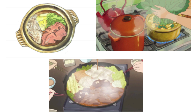
Figure 5: On the top left is my painting based off the Japanese style hot pot from season 1 episode 7 of Midnight Diner: Tokyo Stories (dir. Joji Matsuoka 2016) and to the right and bottom are the reference images used to create the image (top right is from Ponyo (dir. Hayao Miyazaki 2008) and bottom is from the T.V. show Lucky Star episode 17 (2007)). Additional references used are those in Figure 1.
Construction of the plate, rather than compiling and preparing together ingredients, involved a careful study of the shapes and the lines that built those textures and the selection of and interplay between the colors that bring them to life. Anime, being a stylized form, already creates the implicit assumption that the space within the screen is not photorealistic, but a representation of reality. Thus, the 2D anime space is afforded freedoms from the restrictions of reality that live action film is rooted in. So, while each plate plays with the rules dictating Japanese cuisine, they can break the rules of common sense and reality to generate a more impactful image.
The use of colors was explored through the construction of each painting. During the painting process, for every screenshot of food taken, I matched it to a corresponding similar food depicted within a Shinkai or Ghibli film. Midnight Diner’s hotpot was the only dish that needed to be extrapolated by finding tangentially similar dishes and scenes from anime. By doing this, I could effectively analyze how each scene was constructed between the two from the colors, form, arrangement, and linework. At first, I experimented with trying to replicate the general color of each object through combining its depiction in reality with the lighting of the scene. For example, because chives are light green, one would assume to simply use light green with a some blue for a cooler tint in cooler light and an orange-yellow color for warmer tint in warmer light. This was not the case as they were not generating quite the same effect. Thus, the alternative method that was utilized was opening the image into Microsoft Paint and color picking from the anime image itself and then color matching to the colors. Hot pot was the only exception of which was color picked from the image directly, however those tones needed to be heavily modified somewhat to illicit the same appeal as the other two images. In the end, the colors selected became a mix of those taken from the anime screenshots and those taken from the scene within the episode. Nonetheless, they all ended up portraying the same effect.
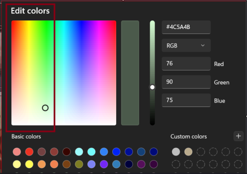
Figure 6: Range of colors color-picked in Microsoft Paint from the reference pictures demarcated by the red box.
Picking colors directly from the images and matching them allowed me to examine the types of colors commonly used across each snapshot. Colors tended to become a warmer brown than expected if they were perceived as yellow with some cooler color tones mixed sparsely to heighten and give depth to the generally warm tones. All colors matched from the images for the use of painting existed among reds, yellows, or in the border between green and yellow within the color wheel. Yellowed, sepia tones across the board give rise to the idea that despite the sometimes seemingly cool toned environment or a neutrally toned environment, there is a warmth used throughout the film to depict these dishes. Warmer filters on images of food are more attractive towards viewers, thus to make the food scenes more visually attractive, warmer tones, such as the varying shades of sepia-yellow-brown, will result in positive viewer reception. However, the colors selected were also generally more saturated than the live action films, which contributes to how the colors contribute to an effort to bring the best visual quality out of the ingredient.
There is also a creation of lines that divide and emphasize the edges of each form. A distinct difference between reality and drawn images is that reality does not have distinct lines when viewed through a photograph, but the end of one form, the beginning of another, and the depth and shape of each is differentiated by shades and differences in colors. These borders created through the anime style can emphasize the shapes by drawing a line where there is none in the lens of reality. Between the live and 2D space, form and thus textures can be further emphasized through the combined use of non-realistic lines layered upon the colors, which are also an exaggeration of live action reality. This can be seen through the more smooth, strong lines used to depict the noodles in ramen versus the wavering jagged lines that outline the edges of the char siu, or those same lines used differently to show the different textures between the leaves and the egg despite the similar use of bumpy, jagged lines. While these lines are not as bold and prevalent in Shinkai’s film, they still exist to create a border and generate texture, but to a lesser effect to somewhat ground the food into reality. I attempted to marry the two by creating a medium line thickness and dramatically fluctuating the line weight intentionally to give variation to form.
Visual elements influence expectations for the dish’s eating experience by indicating the texture and mass of a particular element or whole. Implications for texture, mass, and assumptions about how separate elements interact within a dish give knowledge about the mouthfeel and can add to its visual attractiveness. This can be heightened with the emphasis on form from 2D anime that deviates from those within live action. Saito expresses the act of eating as an inherently “multi-sensory experience, going beyond taste and smell, to include other sensory qualities lie tactile sensation (crunchy, mushy, chewy), visual impression, and sometimes even sound quality.” Sight contributes to informing and contributing to other sensory information on a macro level, that is, before even tasting the dish. Meulen et al. explains the process connecting the crossroads of seeing the dish and “tentative tasting” as “the maximum convergence point of that reversible chasm of touching and touchable, of tasting an tasted.” That is to say, taking in the physicality of the forms that exist within the dish creates an anticipation to consume the dish. Anticipation begets intrigue and attracts the viewer to the dish. Variations in those perceived textures are reminiscent of Japanese culinary aesthetic sensibility. These rules emphasize asymmetrical placement of plates, elements within the plates, and variations in cooking style and vary the textures and presentation of the dish. The result creates visual intrigue through creating a landscape for the eye to travel. This leaves an impression of what to expect from the dish.
Plating the dish is as integral to the perception and judgement of a dish’s aesthetic appeal as it can harmonize the components within the dish while framing them in a way that highlights them best. The term “plating” can be understood as both the arrangements of parts and the vehicle that the meal is delivered. Color and linework contribute in the same ways to the portrayal of the plate. By creating a framework that arranges those components in a visually distinctive way, plating can make or break the aesthetic harmony of the dish. Color picking from the scenes in anime, the bowls and plates that each food was served upon were observed to be far lighter and cooler toned than the foods placed upon them. Contrasting between colors emphasizes the contents within the plate and increases the visual impact. The shape and texture of the plates also work in this way to work with the contents of the dish. Within the plate, portions of food were arranged in varying sized groups that placed the star of the dish (such as the omelet) in the largest space. If it was a mix of ingredients, instead of creating symmetry within the colors or design, placement of meats, garnish, and vegetables were arranged in odd numbered groups that created a varied, but organized landscape that guided the eye across the plate from one element to another. Balance was maintained in the dish through an asymmetrical placement of elements that place no two similarly textured things together and sparsely added bold, contrasting colors in key places to keep visual intrigue. These practices align with Japanese methodology for plating with the emphasis on creating harmony through a marrying the aesthetics of the plate and dish while also adhering odd numbered groups of ingredients.
Screenshots from the live action film movies also use color and arrangements of form with plates to create landscapes of food to follow. However, because additional considerations and elements to color and linework can be done within 2D anime, the visual impact of the dish is multiplied within the 2D scene than the live action. Due to the application of the techniques discussed about color, linework, and form, considerations of where and when to push those techniques and can work to emphasize the visual impact of the image. For example, in the omurice piece, because of the darkness of the plate and the colors selected for the egg within the omurice, the goldenness of the egg is emphasized. The placement of the tomatoes between the cucumbers and egg created the contrast in the smoother lines used for the tomatoes and the jagged lines used for the eggs and cucumber edges. The effect could be seen through the reactions of my peers to the drawn images. All around there was high praise for the drawings and comments about how hungry they became. Already, these images have ingrained themselves into their minds and unlocked sensory ideals and desires to consume the meal. This contrasted the images from the screenshots, which they remarked still looked good, but did not illicit the same reactions and emergence of hunger and longing.
The Makings of a Painted Food Fantasy: 2D Anime vs Live Action Food
Painting and the 2D space is the perfect medium to impart a mental vision of an experience onto the viewer, which creates a longing fantasy or imagination about the food. The anime style affords the artist the ability to manufacture this imagination to a higher degree than a traditional camera lens in film because it can exaggerate figures to a degree where the depiction becomes hyperreal. This is not only because of the manipulation of colors, line, or form, but also the fact that drawing/painting are not truly rooted in worldly reality but can create their own reality with rules that mirror but are not entirely the same as reality. Therefore, within this space, the artist is afforded the use of colors, shapes, and forms that are not present within the real world or grounded in the same rules. The idea is to root the image enough in reality to convey that it is related to the real world but push the boundary of realism to create a more vivid imagination so that the dish can elevate into something “more real” than reality. This is also a characteristic seen within Japanese aesthetics.
To understand how anime creates a depiction of a fantasy of reality, anime must be understood as a medium that is grounded within hyperrealism. Hyper realism can be understood as being a depiction of a heightened, exaggerated form of realism, which is also coined as “second order realism.” Animation, rather than attempting to replicate the world and movement in photorealistic clarity, offers a depiction that is “realist” in convention, but diverges in visual depiction. Animators do not have the goal of creating a photorealistic image but rather, in how Steinberg interprets, “Realism is first and foremost a set of conventions proper to a historically produced configuration of a given medium, rather than a visual resemblance to a given reality.” Within Japanese animation theory, reproducing the image is distinguished from but does not lie in opposition with photorealistic or photographic depictions of the object. The intent, when trying to depict reality, falls under the line of trying to show the “moment-time” and “vital” essence of the object, which can mean depicting it photo realistically, however can also lean into exaggerating aspects of that object. Anime (and manga) follow a unique brand of realism where it is “not a matter of fidelity to a real-world referent…Rather, it is a style of writing that imports the nonnaturalistic, nonrealist media of Japanese animation and comics into a literary form that operates according to principles of naturalism.” Anime lives within this realm of hyper realism rather than striving to be realist. As a result, the anime visual conventions can represent the world through a lens that captures the likeness of the object but can operate such that the object is elevated insofar as the essence (in the words of kaiseki, the rice’s “ricelikeness” or the fish’s “fishlikeness”) of the object is maintained.
Hyper realism or “second order” realism creates the distinction between photographic and animated depictions of objects. In this case, the subject in question is food. Film and photography have immense overlap, since film, created by many split second snapshots, is derived from photography and serves to present objects as part of the real world. However, as a result, film must contend with being visually believable, even when absurd. Within film, real world convention must be upheld in the sense that objects must obey the rules of the real world or how they would exist in the real word. Anime, by its hyperrealist visual language, grounds the essence of objects while the medium (being stylistic and exaggerated) makes it so that viewer understands that the depiction on the screen can operate under different rules for colors, shadows, and form. Thus, Anime’s hyper realism allows it to toe the lines of reality and unreality, warping the scene in ways that suspend disbelief and generate new realities that are so believable, they seem to follow real world convention. As a result, depending on how much reality is pushed or how much the scene resembles reality, anime or any animated, hand drawn, 2D medium can create fantasies about reality rather than showing us an alternative world akin to our own. It is easier to suspend the viewer into believing the image on screen because there is enough of an innate dissonance between the pictorial realm of the screen and the real world that allows what is on the screen to create its own rules. However, with enough references to the real world, the connection between screen and life can be bridged and smoothed, which can overcome the dissonance and bring about a believable fantasy.
The “Ghibli Food” art style exists within the animated space, which allows for the food depicted to become site for imagination and fantasy that is distinct from a photographic depiction of food. While food in live action film grounds the dish within the real world, the exaggerations of color and form within the anime style can facilitate further imaginings of the dish that builds upon a mental fantasy of how the dish could be. The image from a photo lacks the “plasticity” that an animated medium has that allows the object to be warped and shaped in ways in which real life cannot with its rigidity. Within the linework, which already differs from a photorealistic medium like film, the shapes present within the dish do not need to conform to the exact forms in real-like, but they mimic them to get an impression or very close sense of the image. When drawing the mushrooms within the hotpot, it was not important to draw each stalk, but to depict the bundles, softness, and mass of the mushrooms, it was important not to draw every stalk. This already is a deviation from reality, where each stalk can be visually separated, however if they were visually connected and each stalk was undefined, the same effect would not necessarily translate. In addition, animated mediums can uniquely stretch, morph, and adjust “camera” angles to display the dish itself in ways that do not necessarily represent how individuals visually interact with the dish in the real world.
“Ghibli Food’s” anime derived stylistic utility allows for reinterpretation and reexamination of food and presenting that food. Hyperrealism and plasticity can facilitate the creation of a desirable fantasy, but also a desire to recreate and experience the dish itself by forcing the viewer to reexamine the dish and replace what would otherwise be a relatively mundane dish with an elevated version of it. This can be a possible cause for the popularity and favor towards “Ghibli food” or anime food. Crombie discusses how Ghibli’s body of work as a whole works to make spectacle of the domestic and mundane by having scenes take place in an aestheticized lens or portray them in fantastically or unconventionally ways that redefine the mundane and domestic to romanticize the act of living life. For example, she describes Howl cooking in Howl’s Moving Castle in its diegetic traits, but also the movement and how the characters act while cooking, which colors the act of cooking in a different lens that is unfamiliar from real world convention (a man is cooking in a home kitchen for one). In the case of cooking, food preparation, and food presentation, Crombie makes the argument that Ghibli pushes to defamiliarize each domestic moment by using anime’s plasticity and abstractions so that the viewer can reexamine the dish and create a new vision of it. The stillness of an image does not detract from this effect, with Crombie clarifying that “the shapes of animation are dynamic and undefined by nature – automatically defamiliarized by their own instability, even when not in motion.” Through this lens, food depicted in the “Ghibli food” style becomes transcendent from its worldly form and becomes an ideal for reality to emulate. Its effectiveness is only evidenced by the hundreds of likes on Twitter threads, blogs and videos dedicated to making the dishes, and countless edits in tribute to the style.
From the reactions from other students between the artworks and the film stills, while there was undoubtably an appreciation for both aesthetically and longing to eat the dishes on screen, there was a more fervent reaction towards the Miyazaki-Shinkai style. There were comments that various dishes from the films “looked good” or “yummy,” however when I showed them the paintings, there were more comments about how much they wanted to eat it. The difference in saying that an image of a dish looked good versus inspiring hunger makes it so that, on some level, there is a difference in the effect that each image brings. Desirability plays a larger role within these drawn images.
Concluding Thoughts
Examinations into the creation and effect of the Miyazaki-Shinkai “Ghibli Food” anime style foods against the live action stills of the same foods, it is safe to say that the stylistic choices afforded to the anime style created a more appealing image of the dishes. A certain extent of the visual appeal is from a somewhat Japanese sensibility of which ingredients, foods, and plates, but more importantly is a unique appeal to aesthetics and arrangement that overarches what we consider Japanese cuisine. The arrangement of the dish was a universal factor for the aesthetic appeal of each dish between both live action and anime. Impact was then dependent on the medium itself and how they brought out those traits and enhanced the dish’s visual appeal.
A point of contention for analyzing visual trends using Japanese culinary aesthetic tradition can be the unsteadiness of defining an overarching culinary aesthetic for common foods. Majority of the dishes selected to be analyzed are yoshoku, since those dishes seem to proliferate the modern Japanese culinary palette for common people (or this is at least the case within the selection of films), so kaiseki’s “traditional”, formal aesthetic ideals do not necessarily adhere, however there is something to be said about a purposeful “messy” placement of ingredients and how yoshoku is now as “Japanese” as kaiseki or washoku dishes. It is easy to find evidence for kaiseki visual traditions, but commonfolk sensibilities are not as well documented. Nonetheless, there is something to be said about the general attention to detail exhibited to prepare and arrange the dishes.
With the medium being the most important factor, the aesthetic and stylistic choices play a large role in making the dish come alive, which has been shown to be an integral part of the eating process. Anime as an aesthetic and stylistic choice can be a tool used to generate realities and increase the staying power of whatever image or scene in the viewer. The pervasiveness of the aesthetic and why it makes people gravitate towards it is because it offers a unique “rose tinted” fantasy of food that is unreal and above reality. It heightens the experience just enough to incite a mental image and desire to experience the dish itself.